Product Design · Frontend · Quality Assurance
ApexAuto - Electric Vehicle Marketplace
A team-built EV marketplace where I owned the design direction and prototype, implemented frontend pages, and did the testing that caught real defects.
- UI/UX Design
- React
- TypeScript
- Prototyping
- Functional Testing
- Spring Boot
Overview
ApexAuto is a team project for a fourth-year Building E-Commerce Systems course. The goal was a full-stack marketplace where users could browse and compare electric vehicles, save favourites, configure financing, complete checkout, and review past orders - a React and TypeScript frontend against a Spring Boot REST backend and a relational data layer.
I'm including it because it shows things my reporting work can't: interface design, prototyping, frontend implementation, and working through defects inside a team.
My contribution
I owned
- The product's visual direction and interactive prototype, including the interface style, page structure, and how the core customer journeys were laid out
- A build guide translating the prototype into a component and design-token system the team could work from
I contributed
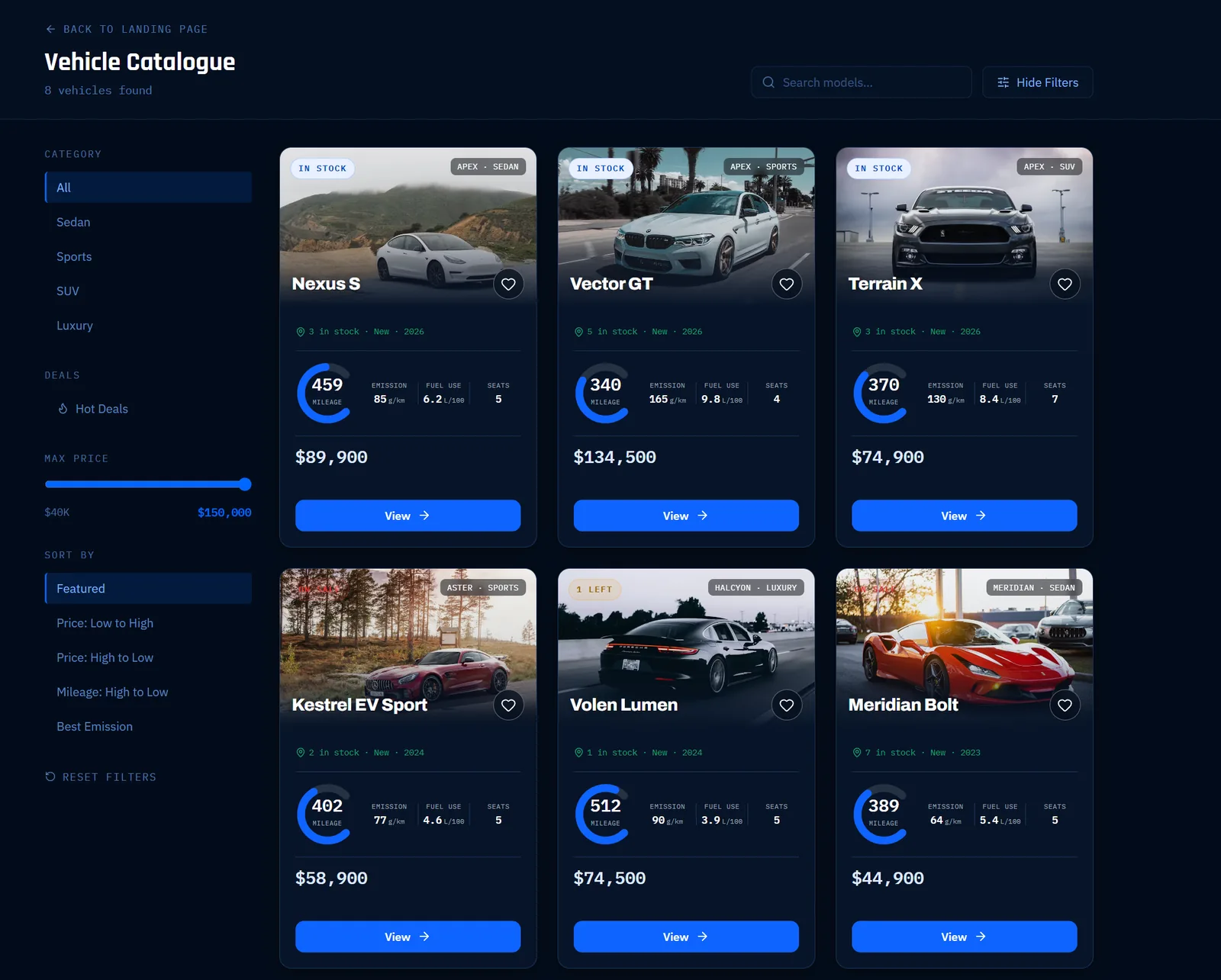
- Selected React and TypeScript pages built from the prototype, including the landing page and the vehicle catalogue with its search, category filtering, price range, and sort controls
- Testing across completed features, reproducing issues and communicating what needed correcting
Built by the team
- The backend services, REST API, and data layer, and the remaining frontend pages
- ApexAuto was a four-person project - this page describes my part of it, not the whole application
Design direction
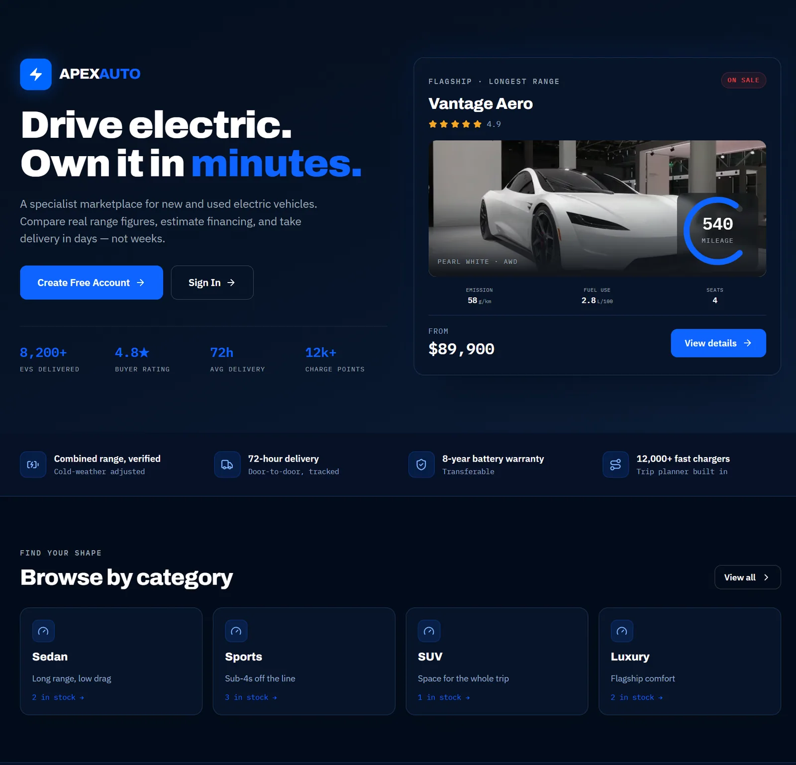
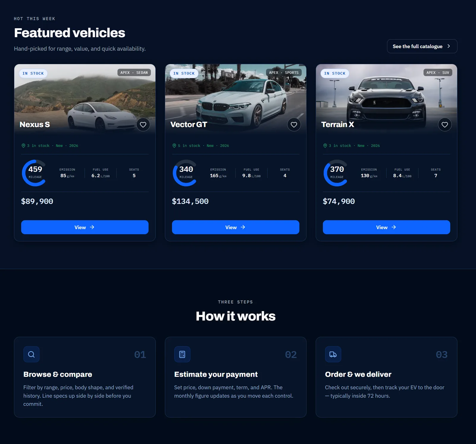
I wanted the marketplace to feel more like a modern automotive product than a university e-commerce assignment, so I built the interface around a digital instrument cluster: a dark navy ground, a single electric blue accent for actions, and technical typography for specifications and figures.
That gave the catalogue a consistent language for the things buyers actually compare - range, acceleration, drivetrain - with a range gauge as a recurring visual motif rather than another row of text. Establishing the system as a prototype first, before anyone wrote production components, meant the team had something concrete to build against instead of resolving styling decisions page by page.
The interface
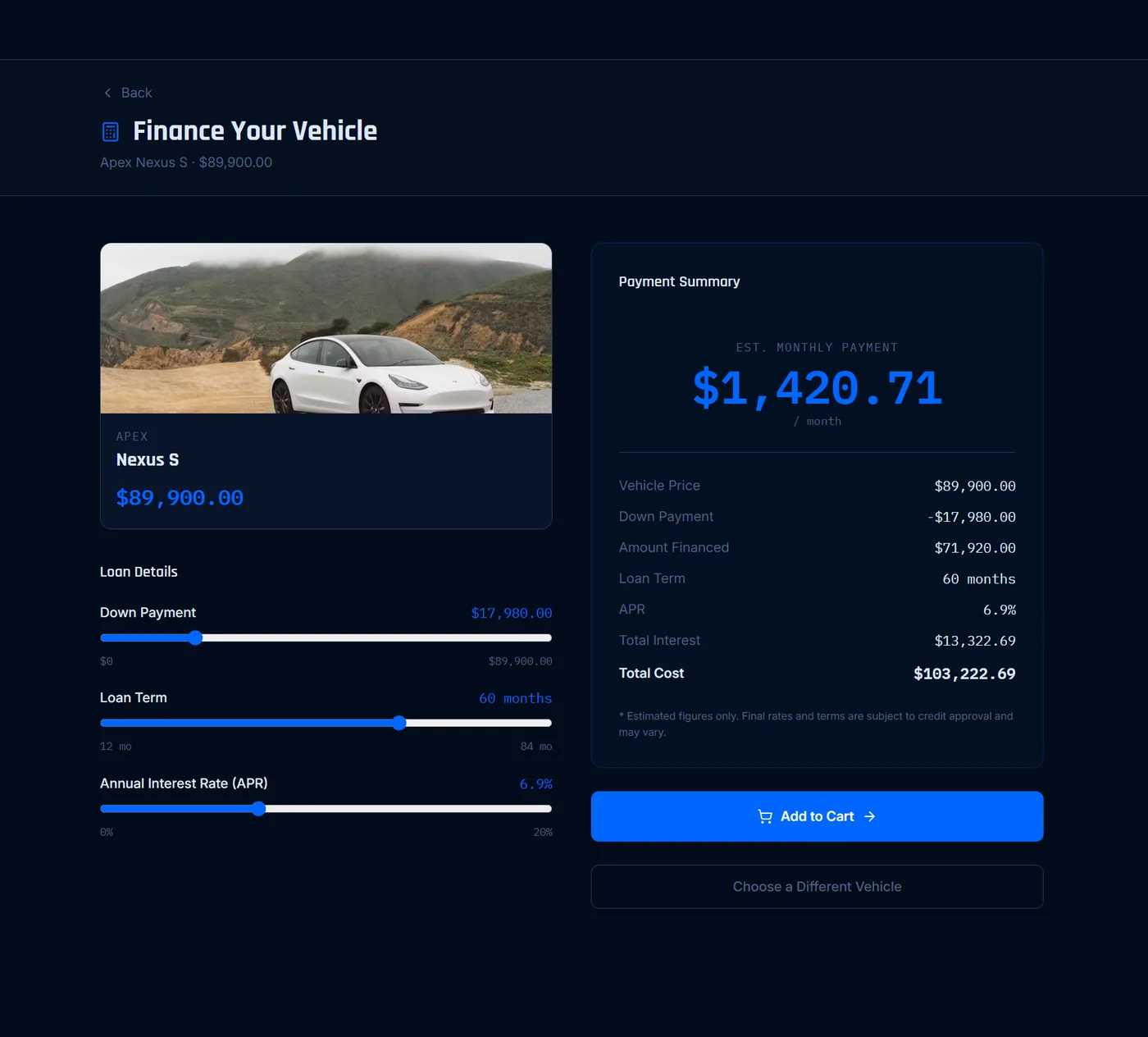
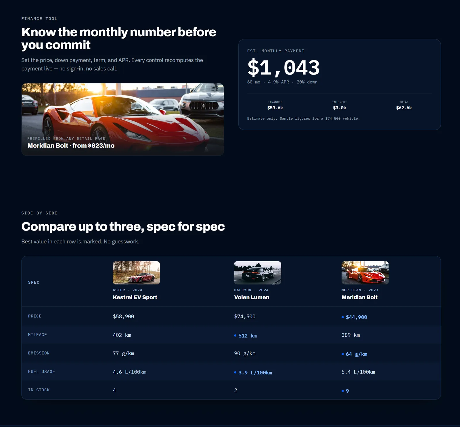
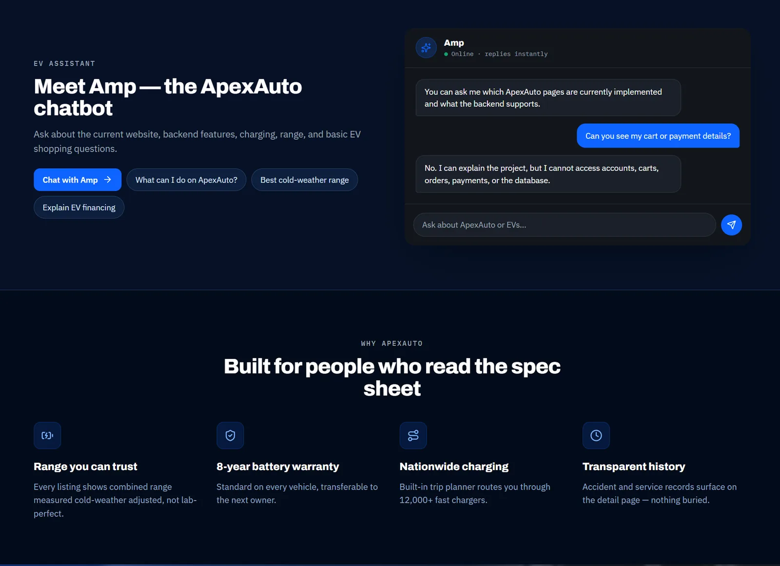
Screens from the live application. The range gauge - the circular arc showing each vehicle's range at a glance - recurs from the hero through the catalogue and detail pages as the product's signature element.
Testing, and two defects worth describing
I tested complete journeys rather than individual pages - browsing the catalogue, comparing vehicles, adding and removing cart items, configuring financing, checking out, and moving through authenticated and unauthenticated states.
Category filtering returned nothing
Released- Symptom
- Selecting a category in the catalogue filtered the list down to zero results, even for categories that visibly had vehicles in them.
- Cause
- The frontend was filtering on a category field the backend's vehicle entity didn't have, so every comparison failed. The filter wasn't broken - it was matching against something that didn't exist.
- Fix
- Rather than block on a backend schema change late in the project, I derived categories on the frontend by mapping vehicle models to their segment, which kept the filter working against the data the API actually returned.
Add-to-cart failed silently
Released- Symptom
- Adding a vehicle to the cart appeared to succeed but nothing arrived in the cart, with no error surfaced to the user.
- Cause
- Tracing the request showed the cart-creation endpoint returning a bare success status rather than a created status with the cart object in the body. The frontend had no cart ID to attach the item to, so the follow-up call had nothing to reference.
- Why it's here
- It's a good example of why testing journeys beats testing pages. Both the cart page and the vehicle page worked correctly in isolation; the defect only existed in the handoff between them, and only reproducing the full sequence surfaced it.
What I took from it
Translating a prototype into a working team product involves more negotiation than I expected. Some design decisions didn't survive contact with the API, and deciding which ones to defend and which to adapt was most of the frontend work.
It also changed how I think about testing. Treating it as part of building - reproducing an issue, working out what was actually happening, and describing it precisely enough for someone else to fix - turned out to be more useful than checking pages at the end.